5 Timeless Publication Design Principles
Follow these guidelines to help your print marketing project stand out — for all the right reasons.

By Rebecca Au-Mullaney
From being bold in your subject matter to creating easy-to-communicate visuals, here are some tried-and-true ways to elevate your creative game for your next print marketing project.
1. Play with color treatments and cropping.
Many publication design projects require you to bring together imagery from multiple sources, such as submitted event photos or headshots taken by different photographers. Color treatments and unexpected crops can help you unify varied photography styles.
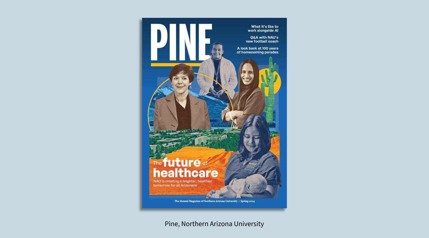
The spring 2024 cover of Northern Arizona University’s Pine magazine is one example; the University of Kansas Cancer Center’s 2022 report is another. In each publication, we deployed color treatments and cutouts to help submitted portrait photography work as a cohesive whole.
2. Mix in maps and charts to make data tangible.
It’s a truism that statistics help underscore an organization’s impact. When these data points are conveyed visually, they pack even more of a punch.
Don’t just present numbers in large fonts. Find the charts or graphs that will best convey the information and allow readers to more easily digest it.
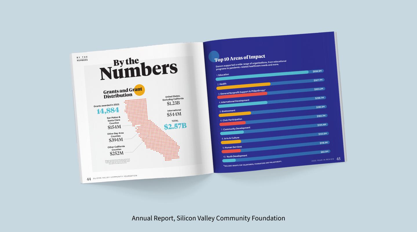
In our work on Silicon Valley Community Foundation’s annual report, we brought in maps, bar charts and more to bring attention to the organization’s grant distribution numbers and top areas of impact. We used similar techniques in Illumina’s 2023 Corporate Social Responsibility report. These visual treatments communicate more powerfully than words or numbers alone.
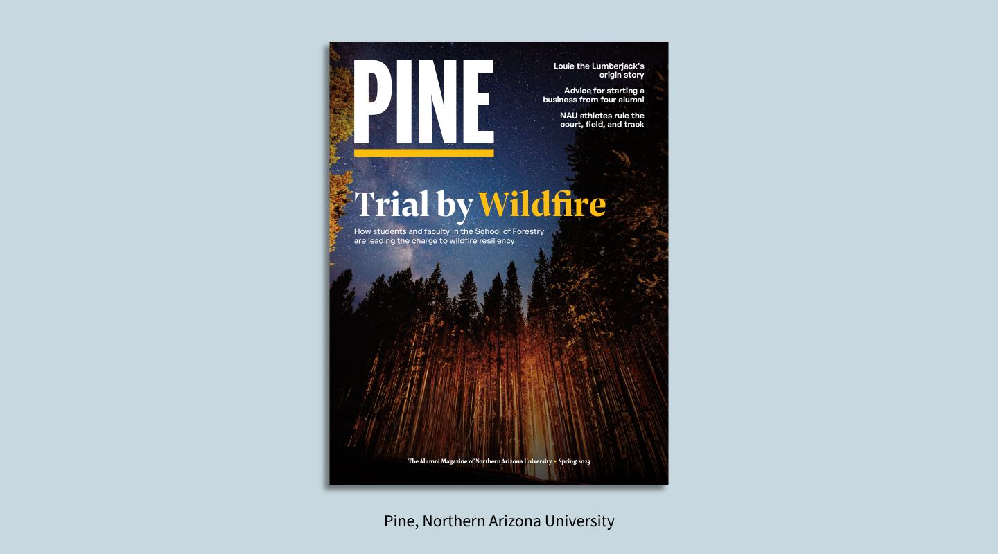
3. Add dramatic environmental shots.
One easy way to make a stronger connection with readers is by adding immersive environmental portraiture.
C/A directed a piece on wildfire research for Northern Arizona University’s Pine magazine, and the cover featured a striking image of a forest ablaze. While including photos of your organization’s people will always be important, turning the lens outward — to the places where those people live and work — can add gravitas and emotional heft.
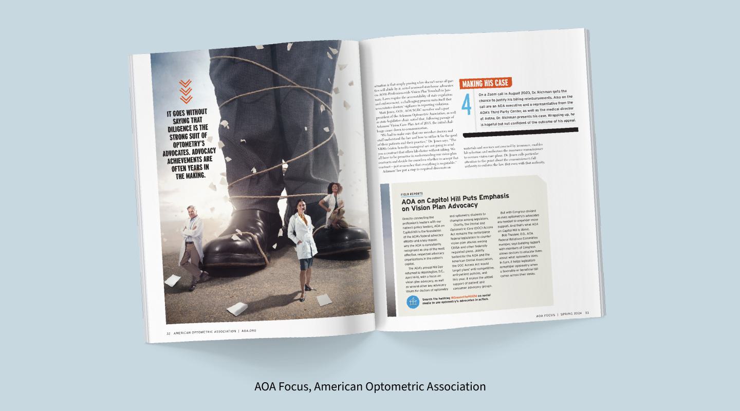
4. Choose a bold metaphor …
For the American Optometric Association’s spring 2024 cover story, the organization told the David vs. Goliath story of doctors of optometry opposing abusive vision plans. With such a powerful metaphor in the copy, we thought it was only fitting to make the imagery just as bold. The result was an arresting cover that immediately communicated the core issues discussed in the feature.
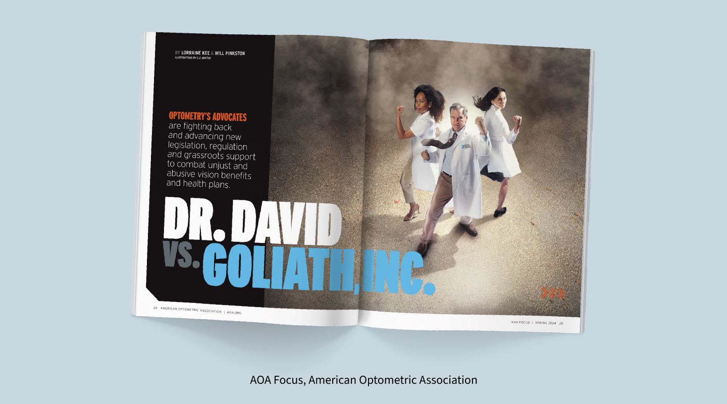
5. … That tells a story.
Every story has a beginning, middle and end. For the interior illustrations in AOA’s spring 2024 cover feature, we continued the David and Goliath narrative with a series of images that showed the giant’s eventual collapse in a flurry of paperwork.
Is Your Publication Holding Your Readers’ Attention?
We can redesign your publication so it makes an impact on your audience and inspires them to take action.

Rebecca has more than a decade of experience in nonprofit, healthcare and higher education marketing, with roles ranging from alumni magazine editor-in-chief to director of strategic communications. At C/A, she spearheads content programs for clients such as the Osteosarcoma Institute and Rutgers University.
When she’s not working, Rebecca can be found exploring every park in a 30-minute radius with her two young daughters. She enjoys journaling, painting and talking big ideas with her husband and friends.