3 Nonprofit Websites, 3 Takeaways
Nonprofits rely on fundraising to survive, but their websites should do more than merely solicit donations. These three nonprofit websites go beyond donation appeals.

By Leigh Flayton
The not-for-profit world is a crowded arena, with countless worthy missions competing for financial support. That means that a key component of every nonprofit website design is incorporating donation calls to action. But the really good nonprofit websites don’t stop there. They engage donors on a deeper level by highlighting their distinctive perspectives and impact at every turn in the user experience.
Casual Astronaut recently launched three such sites that balance appeals for donations with storytelling and strategy.

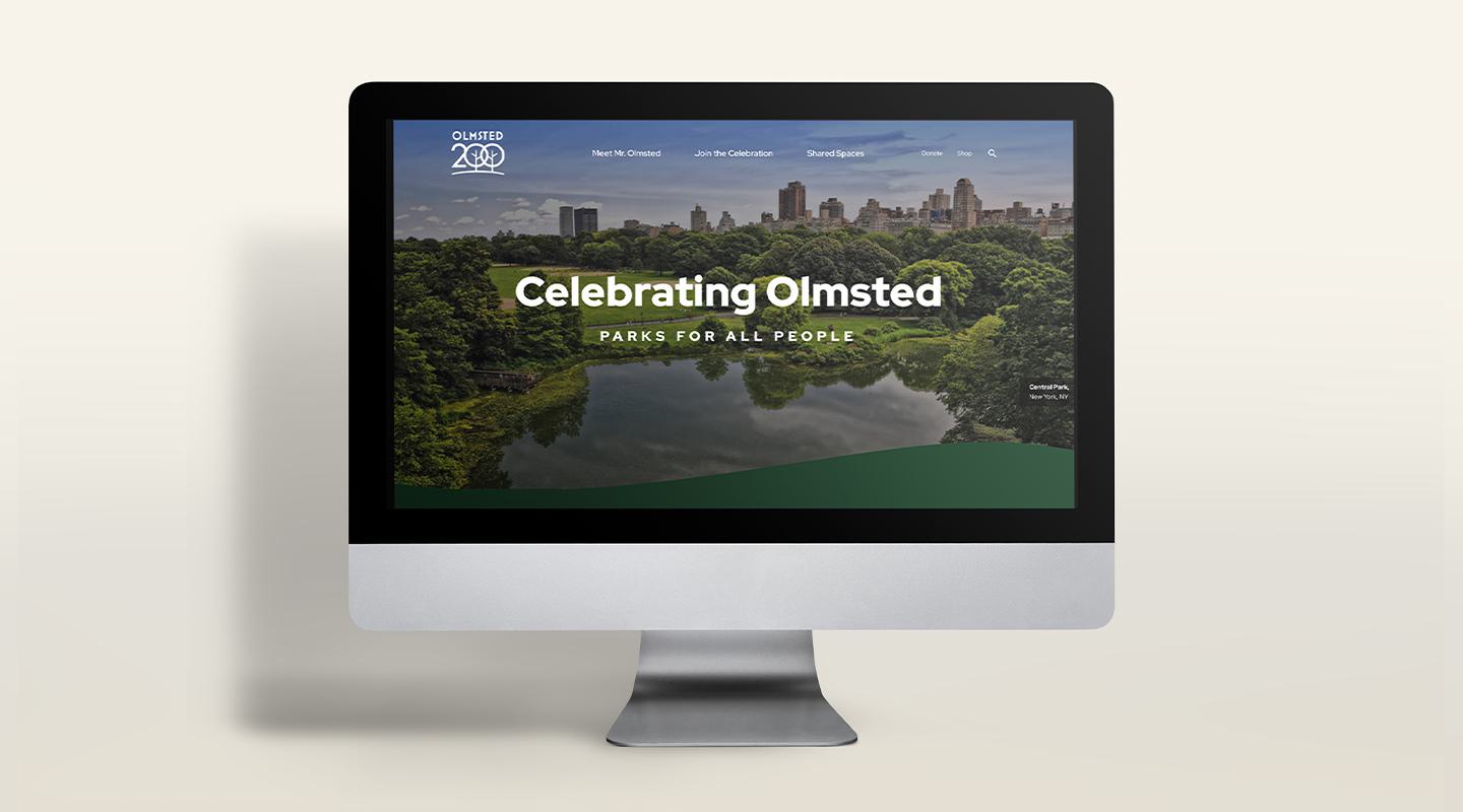
Olmsted 200
Olmsted 200 was launched earlier this year in anticipation of the April 2022 centennial commemoration of the birth of Frederick Law Olmsted. It was conceived to create excitement and engagement in the activities surrounding the celebration — and leading up to the main event — and of course, generate support by inspiring donations to the cause. But C/A knew the site needed to do more: It had to advocate for America’s parks and green spaces, attract partners and advocates, educate site visitors in the principles Olmsted espoused and drive conversations about his legacy. What began as a website to promote a major event became — thanks to a multifaceted site with a robust content hub, myriad resources and interactive features — a nationwide community.

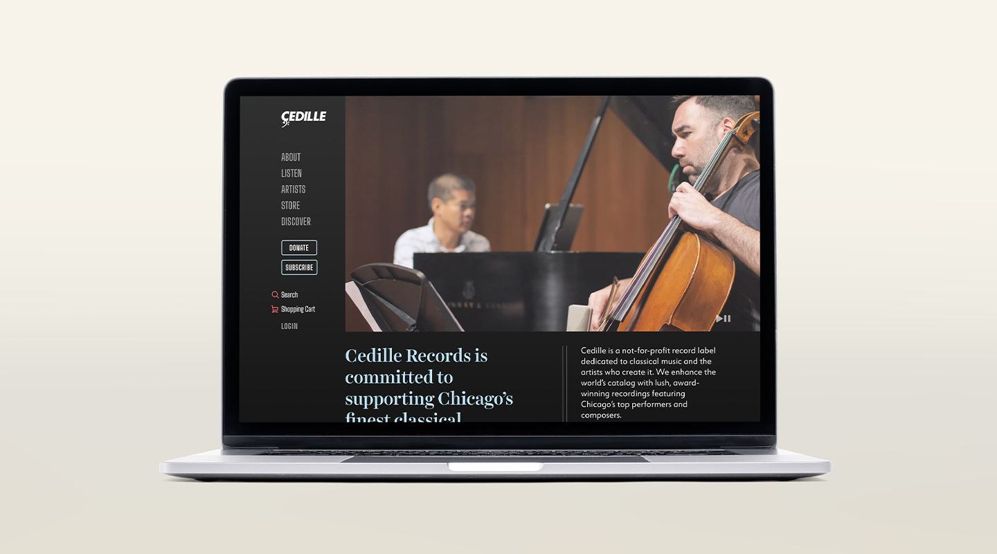
Cedille Records
Cedille Records, a Chicago-based classical music recording company, was founded in 1989 by a classical music lover who wanted to share his passion for the local scene and support the Windy City musicians he so admired. When C/A redesigned the site, we were tasked with creating a vibrant and contemporary digital experience that would further the nonprofit’s mission to “bring Chicago’s finest classical musicians to a worldwide audience by recording, distributing and promoting their work.” Ways to donate to Cedille are promoted throughout, but the site itself is perhaps most successful for its use of striking photography, audio and video to immerse users in the local music scene. This in turn doubles as a way to inspire support not only of Cedille as an organization, but also for the artists, community and larger audience it serves.

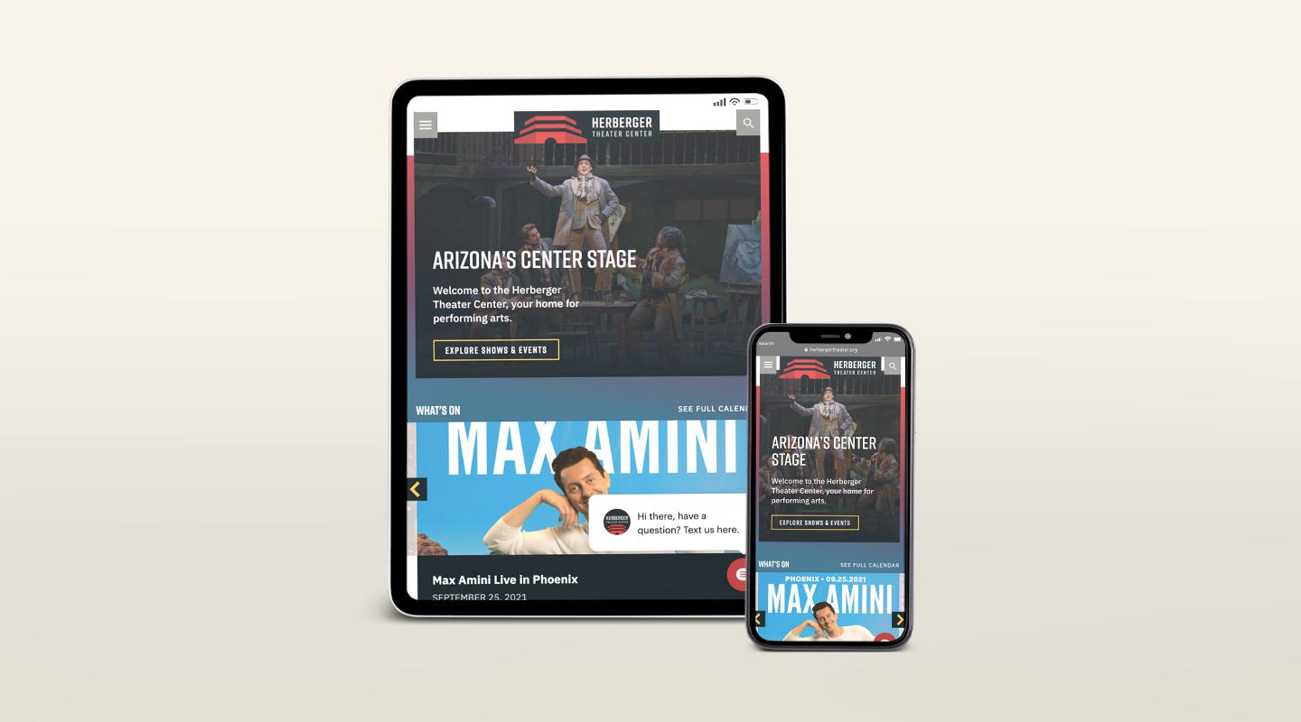
The Herberger Theater Center
The Herberger Theatre Center, a performing arts complex in Phoenix, is home to five resident companies, but it’s also a community space that goes beyond the performing arts. The goal of the rebranded and revamped site was to sell tickets and promote its resident companies, of course, but also to establish the Herberger Theater as a cultural hub and one of Arizona’s premier destinations. As a result, the new site reintroduces the Herberger Theater as more than just a place to see shows. It highlights the performing arts center as the versatile setting that it is, showcasing the many opportunities it offers in the heart of downtown Phoenix — as a destination wedding location, festival host, community activity center, corporate meeting space, a vibrant place to grab drinks, see art and listen to live music. This helps to further establish the Herberger Theater as a multidimensional and integral part of the city.
Is Your Nonprofit Website Everything It Should Be?
We can help design and develop a site that’s rooted in strategy.

